
Umee: Rebranding for the Future

As Umee proceeds to ship mainnet in the coming days, we’re entering an exciting and accelerated change period. And, that change begins with a refreshing of our brand. While it may be a new logo, new color palette, new fonts, and even a new mascot, this is the same Umee with the same mission: to revolutionize cross chain DeFi as we know it. We are overjoyed to release our rebrand to the community across our social media platforms and the launch of our new website!
The journey to establish our new visual identity required various concepts, countless brainstorming sessions, and plenty of fine-tuning. Throughout this process, we strived to maintain while simultaneously progressing the values, personality, and innovation that Umee has become known for. We understand that as mainnet launches, Umee will be exposed to a much larger and active community so we wanted to present a rebrand that could be embraced by all while feeling they are joining the wave at the inception of this journey.
Let’s dive deeper into what the rebrand will look like!
New Look
The new Umee logo/brand icon maintains two elements that were synonymous with the original: the U and wave iconography. While we adored our original logo, we set out to create a new logo that incorporated those respective elements in a more fluid, progressive fashion.
The rebrand reimagines the preexisting logo by presenting three waves staggered on each other to allude to the waves that we will make in web3 while also creating the U shape Umee is known for. The staggering of waves not only presents a bold and sleek look, but reiterates the values of community, innovation, and passion for DeFI working together seamlessly. The end product compiles all of these ideas into a compact, yet instantly recognizable logo that will represent Umee for years to come.

Inspiration
If you’re familiar with Umee, you know that a large portion of our branding consists of allusions to waves. Umee does translate to “ocean” after all. We wanted to ensure if we were reimagining the Umee brand that the ocean would play a large part. That’s where the color palette comes into play.
When you think of waves, you think of the color blue. However, as we continue to make waves throughout the cross chain ecosystem, we had to think about the bigger picture. We wanted to be inclusive of everything occurring under ocean waves and that’s when we stumbled upon the idea of coral reefs. Teeming with life and vibrant colors, coral reefs around the world are representative of what you can find when you go beyond the surface.

The pink-to-purple-to-aqua gradient as exhibited in the new brand icon flows effortlessly to create an encapsulating nod to the ocean while representing the uniqueness Umee has established. With an extended color palette aside from the core gradient, the additional colors will be used throughout the new website and future marketing materials.
Adora
As we set out on our rebranding journey, one thought that was on top of mind was: what if Umee had a mascot? Luckily, we were able to create the perfect representation of Umee. Everyone, meet Adora!
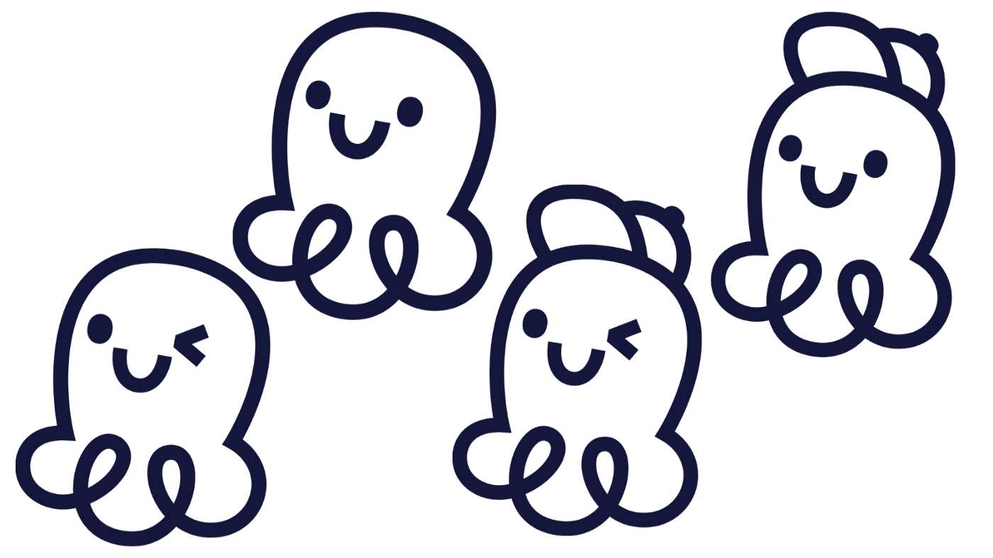
Inspired by the Adorabilis, a species of umbrella octopus, Adora came to be. Short for “adorable,” Adora is representative of a creature filled with intelligence that is unmistakable and unforgettable once you come across it. Umee has always strived to weave a sense of approachability and friendliness in our social media and marketing campaigns. With Adora’s round shapes and affable nature, we feel Adora exemplifies those qualities.
We know how daunting DeFi can be to newcomers. More times than not, you will need a friend to help you as you begin to explore the world of DeFi as there is so much to learn and experience. Why not have a “DeFi buddy?” We hope that Adora grants users the ability to ground these abstract concepts with something they can associate with every time they think of Umee.
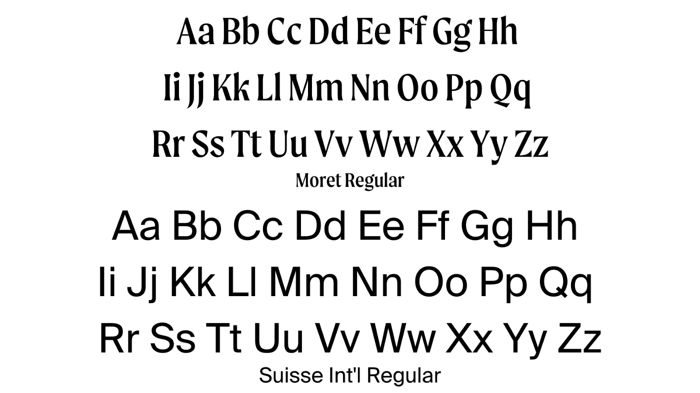
Fonts
With any rebrand, the fonts utilized will need to be representative of the values established. The font families we will be utilizing across marketing materials and the new website come from the Moret and Suisse Int’l families. That said, the wordmark in the logo is of the Moret font family. We felt that this font, in particular, captured a more nuanced and sleek look than the previous wordmark.
Coinciding with the overall theme of friendliness and inclusivity of this rebrand, these new fonts allow for a clean yet memorable reading experience.
Let us know your thoughts!
As we look towards the future, namely mainnet launch, we believe that our new brand identity will resonate with everyone looking to be part of Umee’s journey. Let us know what you think of the rebrand across our social media channels, we’d love to hear what you think!
Head on over to our new website: https://umee.cc/. You’ll see all our rebranding efforts come to life and displayed as we envisioned them!